Signal Vizualizers
Animated visualizers for signal processing.
Simulations for the animations are created with NeuroDSP.
Animations are available for re-use under the CC-BY 4.0.
Developed by
Tom Donoghue.
This project is maintained by TomDonoghue
Overview
This website hosts a series of animated visualizers for exploring signal processing, including demonstrating different kinds of time series and common processes in digital signal processing.
The code to make the animations, and copies of the visualizations are available in the source repository.
Table of Contents
This page contains the following sections:
Time Domain Signals
The following plots show different kinds of simulated time series.
- the left plot shows the ongoing time series
- the right plot shows the corresponding power spectrum
Oscillatory Signals
First, we have an oscillatory signal, showing rhythmic activity:

Aperiodic Signals
Next, we will explore some aperiodic signals.
First, white noise, defined as having equal power across all frequencies (a flat power spectrum):

Next, we have pink noise, which has a pattern of decreasing power across increasing frequencies:

Finally, we have brown noise, with has a steeper drop-off of power across increasing frequencies:

Combined Signals
Next up, we have ‘combined signals’, which are a combination of periodic and aperiodic components:

Finally, we have a bursty signal:

Fourier Transforms
In the following visualization, a time series (bottom left, black) is reconstructed (red), by a sum of many sinusoids (top left). On the right, the phase (top) and amplitude (bottom) of each sine wave is plotted.
Aperiodic Signal
In the following, the time series is an aperiodic, pink noise signal, decomposed by an FFT:
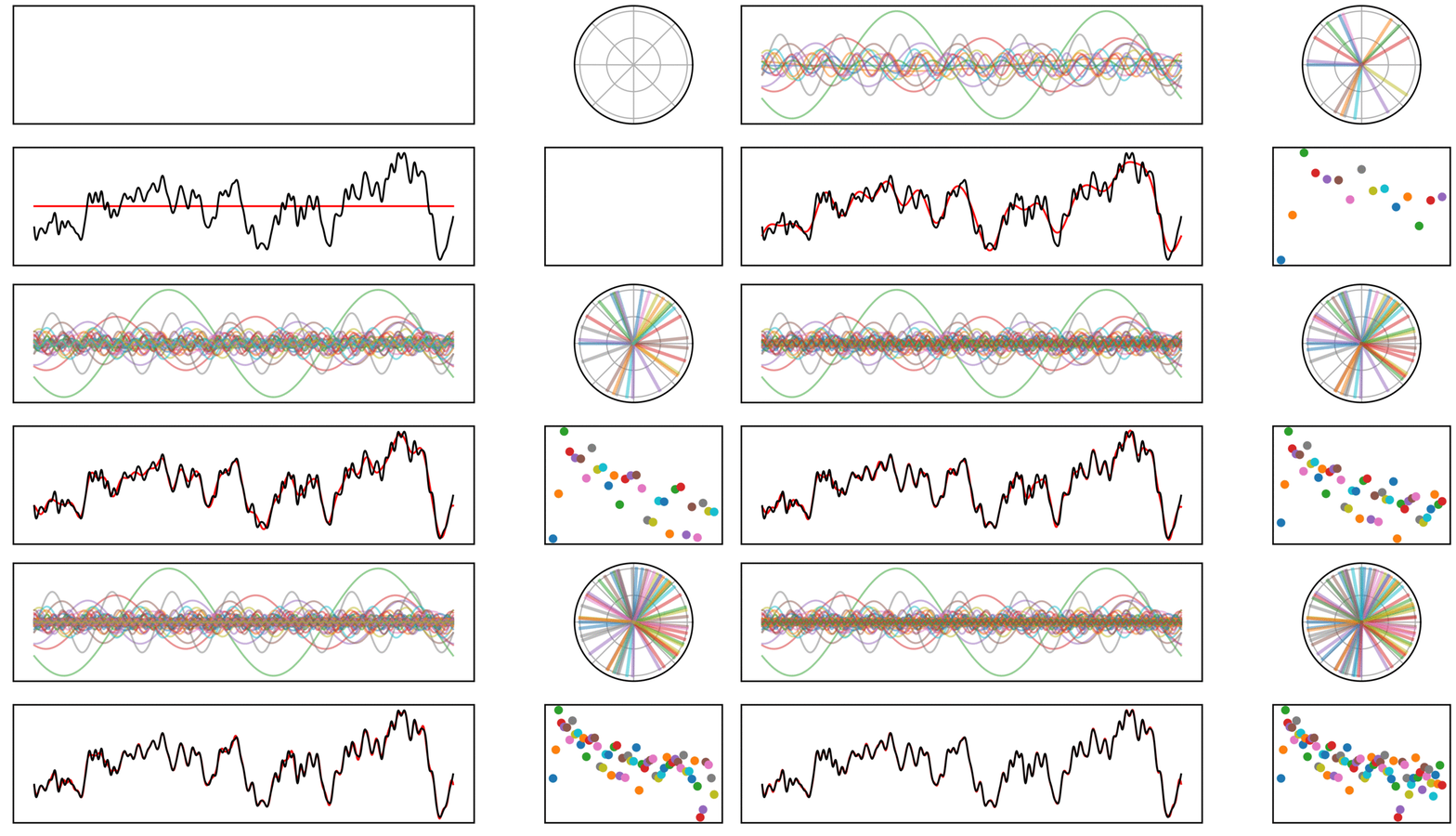
Note that in the above, the signal is completely non-rhythmic.
Despite the signal not being rhythmic, it can still be decomposed by a sum on sinusoids.
Periodic Signal
In the next signal, there is both an aperiodic component (pink noise), as well as a periodic component (a 10 Hz rhythm).
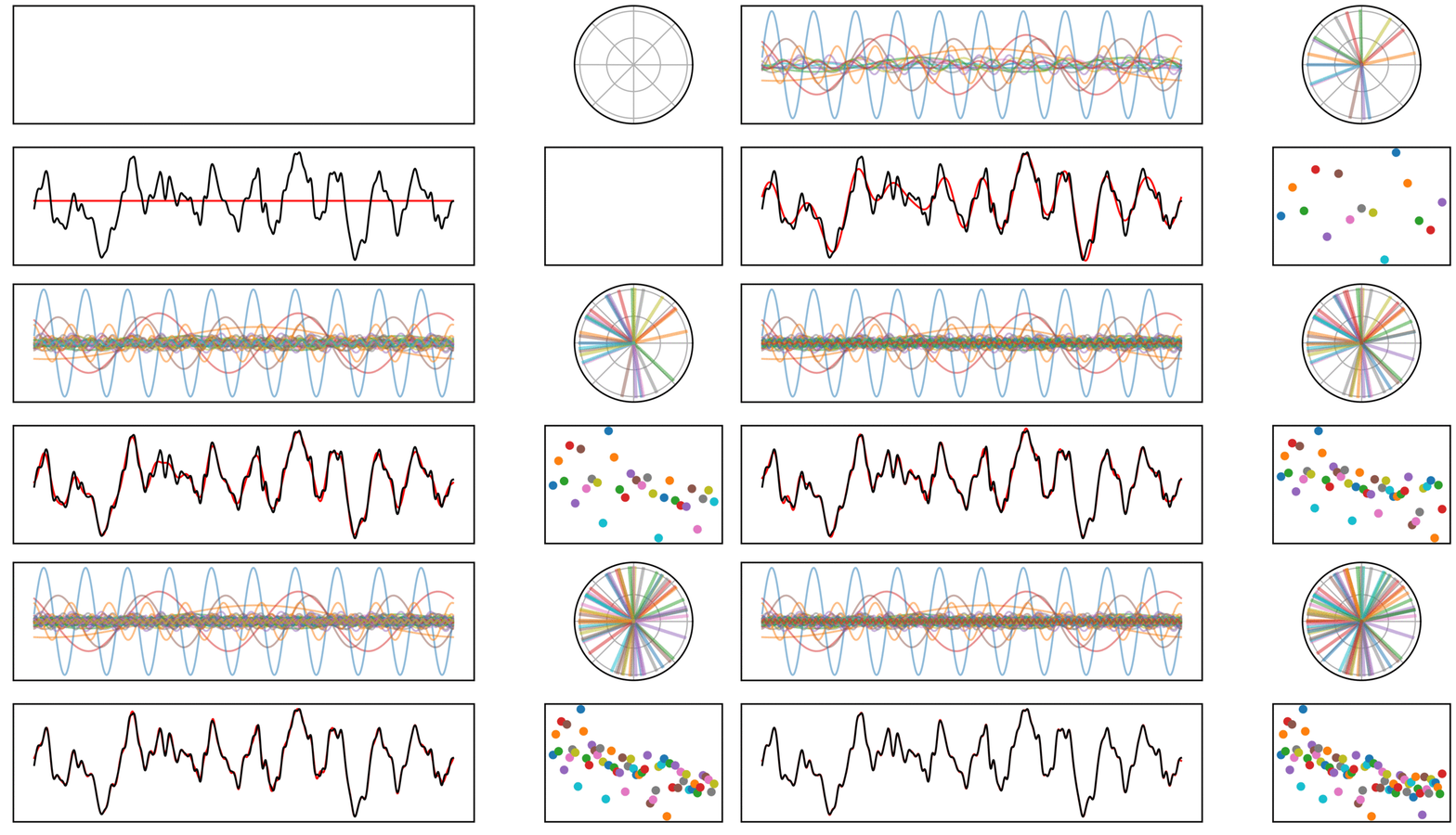
In the above signal, note how the prominent rhythm is fit by a sine wave which stands out from the other frequencies, capturing the higher power in this frequency.
Convolution
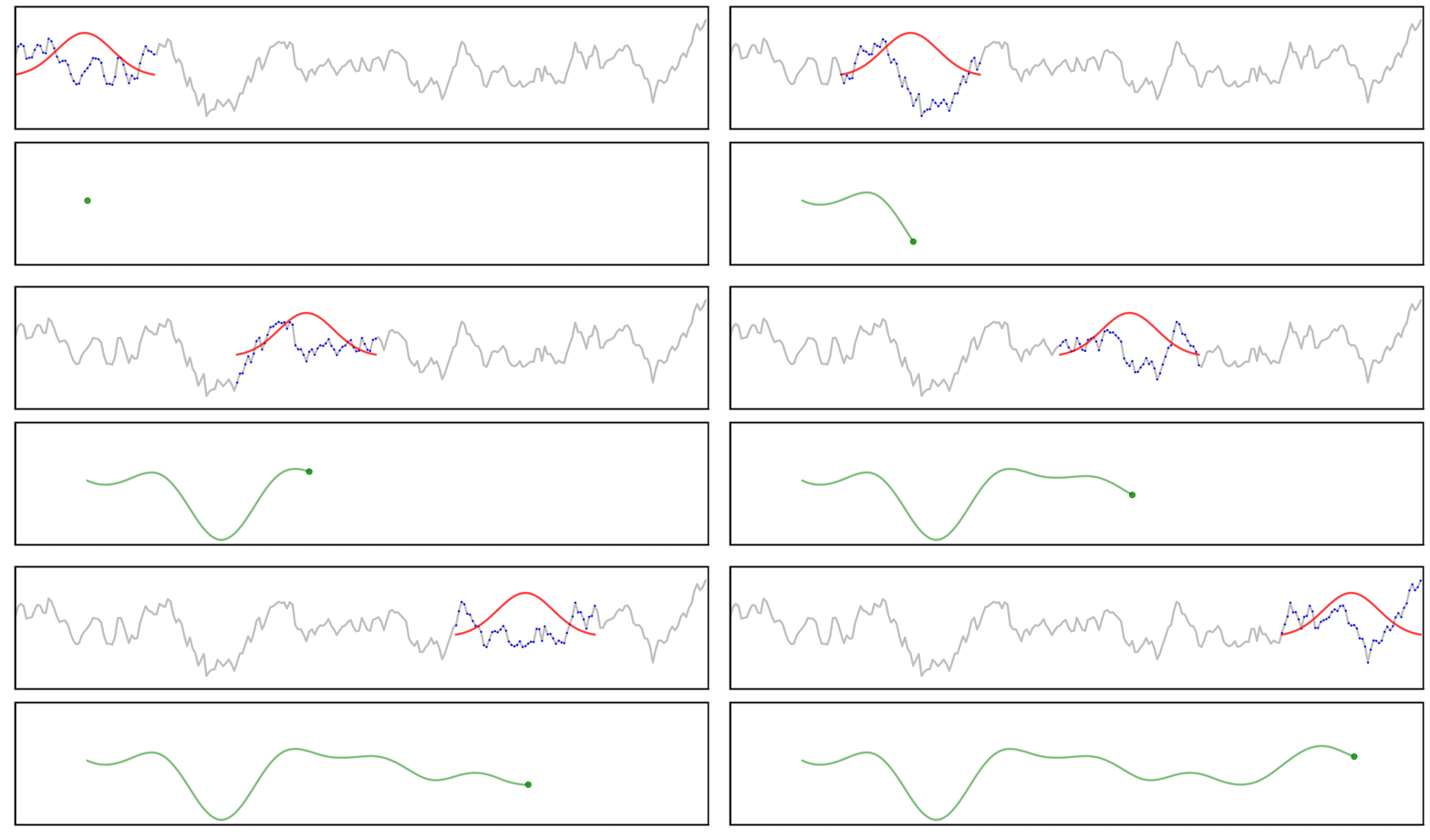
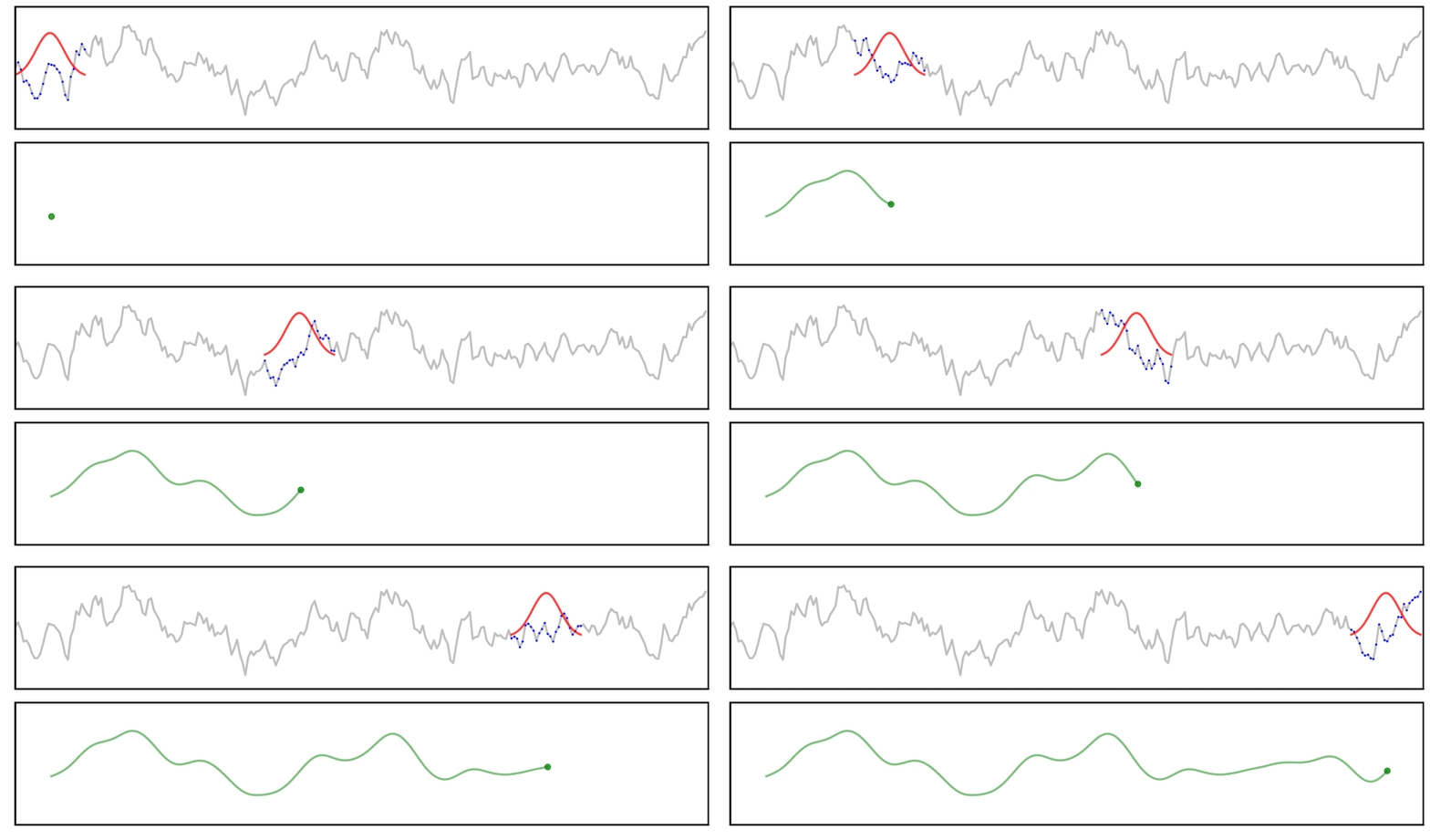
Here, a signal (grey) is convolved with a gaussian kernel (red), meaning we “slide” the kernel across the signal, computing each output value (green) by multiplying the kernel with the underlying signal (blue).
Long Kernel
In this first example, we will examine convolution using a long kernel.
Short Kernel
Next, we can examine how things are different when we use a shorter kernel.
Technical Notes
Some technical notes on the convolution:
- The “multiplication” applied between the kernel and the signal is the dot product
- Only the range where the kernel fully overlaps the signal is shown
- By definition, convolution applies the reverse of the kernel
- In these examples, the kernel is symmetric, so it doesn’t change anything
Filters
This section explores applying (FIR) filters to time series.
Filters as Convolution
Applying a filter to a time series can be visualized as the convolution of a filter kernel with the data.
First, we can use a simplified example showing the application of a filter kernel (for a narrowband bandpass filter) to a burst signal:

Next, we can look at a applying a filter kernel to a ‘combined’ signal:

Applying a filter does not guarantee the extraction of a rhythmic component of the signal.
For example, we can see this in the ‘ringing’ in the output of applying a filter to a step function:

Notably, due to the shape of the filter kernel, outputs will tend to be smooth & rhythmic, even if the original data is neither.
For example, if we apply a bandpass filter to aperiodic (pink noise) data (non-rhythmic by definition) - the filter output still looks rhythmic:

Filter Outputs
Another way to look at filter outputs is to compare the outputs across different filter kernels.
First, we can see how the output varies across different n_cycles, when applied to a burst signal:

Next, we can see how the output varies across different bandwidths:

We can do the same for a step function signal, first with n_cycles:

And also with bandwidths:

Filter Properties
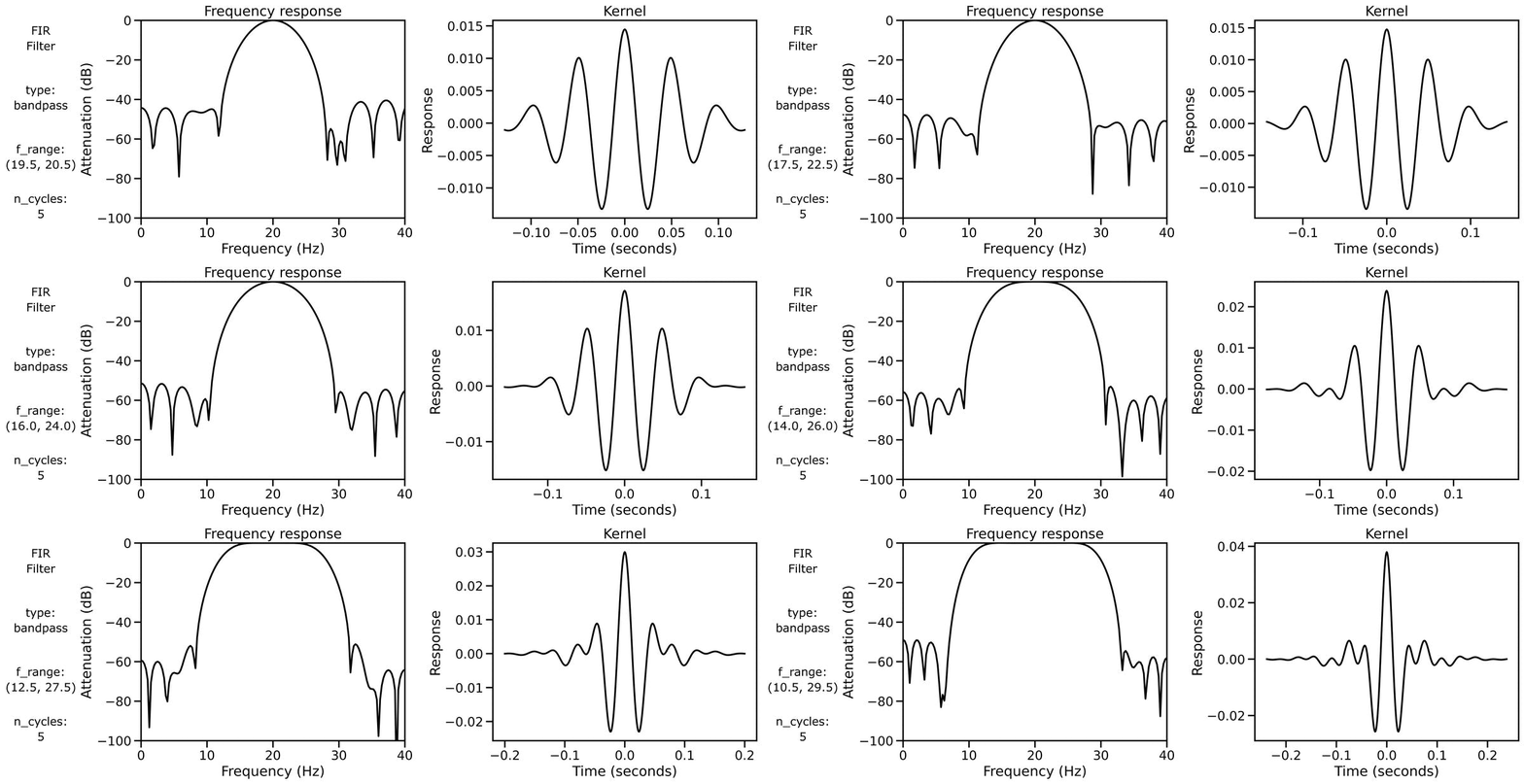
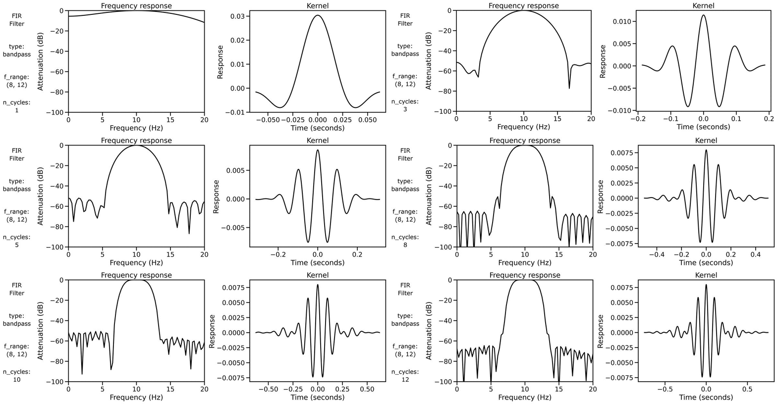
Finally, we can examine filter properties, explicitly examining the frequency response and filter kernel across different filter definitions.
First, we can look at the filter properties applied to a burst signal across different n_cycles:
We can also look at the filter properties applied to a burst signal across different bandwidths:
